§ 3.2 — The Standard
User Interfaces
3.2.0 Introduction
User Interfaces or UI are a type of exposer component mainly targeting humans for interaction with the core business layer, unlike Communication protocols primarily used in distributed systems. UIs are forever evolving in terms of technologies and methodologies with which humans can interact with any given system. This goes from web applications to virtual/augmented realities�voice-activated systems and, more recently, brain-waves-activated systems.
Developing user interfaces can be much more challenging in terms of experiences. Today, there needs to be a global standard for intuitive understanding. It heavily relies on culture, commonalities, and many other forever-changing variables. This Standard will outline the principles and rules for building modular, maintainable, and pluggable UI components. However, there will be a different Standard for outlining user experiences, human interactions, and the theory of intuitiveness.
This Standard also briefly highlights specific guidelines regarding rendering choices, server, client, or hybrid, as is the case with the tri-nature of everything. Let’s dive deeper into the principles and rules that govern building UI components.
3.2.0.0 Principles & Rules
Like every other exposer component type, UIs must be able to map processes, results, and errors to their consumers. Some of these UI components will require a test-driven approach. Some others are more like Brokers, just wrappers around third-party or native UI components. Let’s discuss these principles here.
3.2.0.0.0 Progress (Loading)
The most important principle in building UI components is to develop intelligence to keep the user engaged while a particular process is running, such as a simple spinner or a progress bar to keep users informed at all times of what’s happening behind the scenes.
It violates The Standard to indicate progress if nothing is happening in the background. It falls into the practice of wasting end-users’ time and lying to them about the actual status of the system. However, assuming the system is busy working on a particular request, three levels of communication can happen on an exposer component to communicate progress. Let’s discuss those in detail:
3.2.0.0.0.0 Basic Progress
The basic progress approach is where you present status with a label like “Waiting …” or a spinner with no further indication, which is the bare minimum of progress indication. No UI should freeze or stop their hanging while requests are being processed in the background, assuming an eventual consistency pattern is not attainable for the current business need.
Some web applications show a forever progress bar at the top of the page to indicate progress. From an experience perspective, depending on the visibility level of these progress bars, they may be challenging for end users to miss. Some other engineering teams have chosen to play a simple animation to keep users engaged with visual progress without any indication of the details of that progress.
3.2.0.0.0.1 Remaining Progress
Above the bare minimum, there is an indication of remaining time or progress to be completed before the request is processed. An indication such as “40% remaining” or something more specific like “5 minutes remaining …” to help end-users understand or guestimate how long a time or effort is left; or, there are patterns where engineers would indicate how many tasks remain without showing what these tasks are.
Sometimes, a remaining progress update is as detailed as UI engineers can get. For instance, if you are downloading a file from the internet, you can’t be more precise than “saying x percent of the bits remaining to be downloaded” with no further details. Some game developers also choose to visualize the internet speeds and available disk space to keep the end-user engaged in the system. These are all acceptable patterns in this Standard.
3.2.0.0.0.2 Detailed Progress
The highest level of reporting progress is the detailed progress type, where the UI component is fully transparent with its consumers by reporting every step of progress. This type of progress is more common in scientific applications. Engineers in debugging mode may enable a feature where all the underlying activity in the system is visualized through the UI.
This type helps end-users understand what is happening behind the scenes and allows them to communicate better details to support engineers to help them fix an issue if the process fails. However, this process is only sometimes preferred in terms of experience, considering that some details need to be hidden for security reasons.
In summary, selecting the correct type of progress indicator in a UI depends on the business flow, the type of users interacting with the system, and several other variables we will discuss in The Experience Standard.
3.2.0.0.1 Results
UI exposer components will report a result to indicate the completion of a particular request by end-users. Consider registering a new student in a schooling system. There are several ways to show the registration process has been completed successfully. Let’s discuss those types of results visualization in detail here.
3.2.0.0.1.0 Simple
The simple indication of success is when the UI reports that the process was completed without further details. You may have seen some of these implementations for this type, such as “Thank you, request submitted” or something as simple as a checkmark with a visualization of green color that indicates success.
Simple results indications, especially with submitted requests rather than retrieved data, may add more details in the next course of action.
3.2.0.0.1.1 Partial Details
An overview of the nature of the request and where it stands in terms of status and timestamps: The other type of results or success indication is to present end-users with partial details. Partial details are usually helpful when it comes to providing the end-user with a “ticket number” to help end-users follow up on their requests later to inquire about the status. This pattern is typical in e-commerce applications where every purchase request may be returned with a tracking number to help customers and customer support personnel assess the requests.
Detailed results can also be beneficial for visualizing the success process, especially with requests containing multiple parts. Larger requests, such as an application to join a university or the like, may include attachments, multiple pages of details, and confidential information such as payment details or social security numbers.
3.2.0.0.1.2 Full Details
Sometimes, one may prefer to report full details about the submitted request, especially with smaller requests that may help end-users review their requests. Some engineers may display full details as an extra confirmation step before submitting the request. However, full details can also include more than just the requested details. It could include a status update from the server a long with an assigned point of contact or an officer from maintenance and support teams.
It’s a violation of The Standard to redirect end-users at the submittal of their requests with no indication of what happened.
3.2.0.0.2 Error Reports
Error reports primary responsibility is to inform end-users of what happened, why it happened, and the next course of action. Some error reports don’t indicate any course of action, which can be a poor experience depending on the business flow. However, the bare minimum in error reporting is the basic indication of the error with essential details. Let’s talk about those types here.
3.2.0.0.2.0 Informational
The bare minimum of error reports is the informational type, which indicates an error occurred and why it happened, such as “Request failed. Try again” or “Request failed contact support.” There are also informational errors that are time-based, such as “Our servers are currently experiencing a high volume of requests. Please try again later.” These informational error reports are necessary to keep the end-user engaged with the system.
Informational error reports are governed by the context and the type of users receiving them. In a scientific application, the more details, the better. For some other systems, it is important to shift the technical language of the errors to a less technical language. For instance, we can’t communicate: “Student id cannot be null, empty, or whitespace”. We should select a more readable language, such as “Please provide a valid student Id”.
3.2.0.0.2.1 Referential/Implicit Actions
The second type of error report is the referential type. When an error occurs, it automatically informs the support team and returns a reference of a support ticket to end users so they can follow up. You may see this often when video games fail to start or specific applications cannot initialize. Referential error reports are the best for particular business flows since they take care of all the actions, email the end user the reference number, and follow up within a couple of days to report the status.
The fewer actions a system requires users to take after a failure has occurred, the better. Since end-users have already accomplished their tasks in submitting requests, it becomes even more convenient if the original request is queued up, such as with high-volume enterprise systems, so end-users don’t have to re-submit the same data.
3.2.0.0.2.2 Actionable
The second type of error report is the actionable report. Errors provide an additional action for the users to go further in their request. For instance, error reports can give a button to try again or submit other details requests back to the engineering and support teams.
Some reports will provide a different route to accomplish the same task in more hybrid legacy and modernized applications. These actionable reports are more convenient than informational reports. However, they would still require their end-users to take more actions and keystrokes, leading to some inconvenience.
3.2.0.0.3 Single Dependency
Any exposer component can only integrate with a single dependency at a time. For UI components, contract purity ensures that a UI is not given more data than it needs. To enforce this pattern, a new type of foundational-like service is implemented, and all other details, such as audit fields, timestamps, and such, are taken care of away from the UI component’s sight.
We will talk in detail about view services shortly as we progress talking about UI exposers.
3.2.0.0.4 Anatomy
Just like the data flow in any service. We have brokers -> Services -> Exposers. UI components also form their own data flow in terms of rendering. Let’s take a look at the anatomy of UI exposers in this illustration:
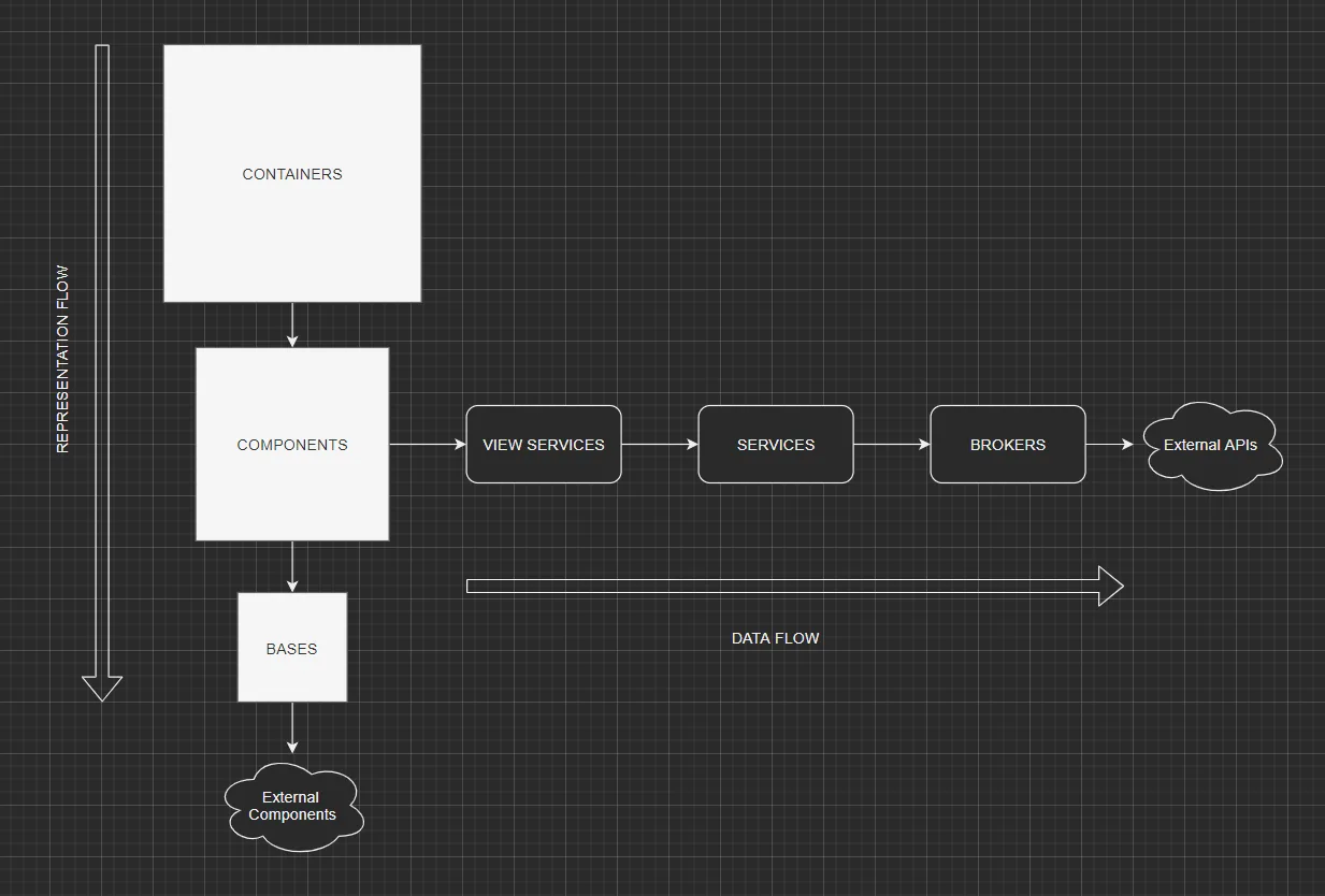
UI exposer components, as shown above, can be Bases, Components, or Containers. Each of these types has a specific responsibility to ensure the maximum maintainability and pluggability of the system, according to The Standard. Let’s discuss these three types here:
3.2.0.0.4.0 Bases
Base or Base Components are just like Brokers in the data flow. They are simple thin wrappers around native or 3rd party components. Their primary responsibility is to abstract away the hard dependency on non-local components to allow the system’s configuration to switch to any other external or native UI components with the least effort possible.
Base components also make it easier to mock out any external or native component’s behavior and focus the effort on ensuring the local component performs as expected. In the following chapter, we will discuss base components for web applications in Blazor and other technologies.
3.2.0.0.4.1 Components
UI Components are a hybrid between a Service and a Controller in the data pipeline. In a way, components contain some business logic in handling interactions with certain base components. However, they are also limited by integrating with one and only one view service. Components are test-driven. They require writing tests to ensure they behave as expected. However, they also contain almost no iteration, selection, or sequencing data logic.
The most important aspect of UI components is the intersection between the UI flow and the data flow. They are responsible for leveraging their data dependency (view services) and their base components to become easily pluggable into container components (like pages with routes in web applications).
3.2.0.0.4.2 Containers
Container components are orchestrators/aggregators of components. They are the actual route or page end-users interact with. Containers cannot have any level of UI logic in them, cannot leverage base components, and may have any number of UI components as the business flow requires.
As is the case with every category of components, containers cannot integrate with other containers. The rule applies across the board for every data or UI component.
3.2.0.0.5 UI Component Types
UI components come in all different shapes and sizes. The hosting environment and the type of devices that serve these components play a significant role in determining the technologies and capabilities a particular UI component may have. In this section, we will discuss the different types of UI components.
3.2.0.0.5.0 Web Applications
The most popular type of UI application is web application because of its ease of use. Web applications require no installation of any kind, and they are not dependent on the operating system running the system or the type of devices users may be using. They can run on PCs, tablets, mobile phones, TVs, and watches that support web browsing.
Web frameworks have evolved dramatically in the last few years due to their popularity, as mentioned earlier. Some frameworks allow engineers to write web applications in many programming languages. The evolution of web assembly has also opened the door for engineers to develop even more scalable frameworks with their preferred technologies and languages.
Server-side applications and client-side applications. In terms of rendering, web applications are developed in two different types. In the next few chapters of The Standard, we will discuss the advantages and disadvantages of each type in addition to the hybrid model.
3.2.0.0.5.1 Mobile Applications
The second most popular platform today for developing UIs is the mobile world. Developing mobile applications comes with challenges as they depend heavily on the operating system, the phone’s size in terms of resolution, and the available native controls. Mobile applications are also always client-side apps. They are just like Desktop applications. They must be compiled, provisioned, and published to an app store so consumers can download, install, and leverage them daily.
The most significant advantage of mobile applications is that they allow offline interactions, such as mobile games, editing apps, and streaming services with offline capabilities. However, building mobile applications with web frameworks is becoming increasingly popular, as the web is a universal ecosystem that allows end-users to experience software the same way on their PCs, browsers, and mobile applications. This trend will eventually enable engineers to develop systems for all ecosystems at the least possible cost.
3.2.0.0.5.2 Other Types
We may need to cover other types of UI components in our Standard. These types are console/terminal applications, desktop applications, video games, virtual/augmented reality software, wearable devices, and voice-activated systems. The world of Human-Machine-Interface HMI is evolving so rapidly in the age of the metaverse that we might need to create special chapters for these different types at some point.
This chapter lives on GitHub, where it is written in the open. Read the source or suggest a change.